This logo currently used by Cornell's LGBT+ Resource Center was created to coincide well with the Women's Resource Logo, while being it's own identity. Friendly bright colors are welcoming, and the red Cornell clock tower ties the center to the university. (2015)
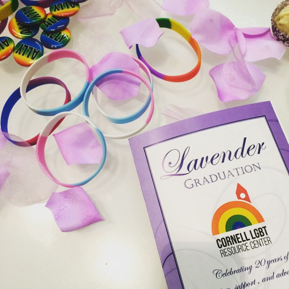
This logo currently used by Cornell's LGBT+ Resource Center was created to coincide well with the Women's Resource Logo, while being it's own identity. Friendly bright colors are welcoming, and the red Cornell clock tower ties the center to the university. (2015)
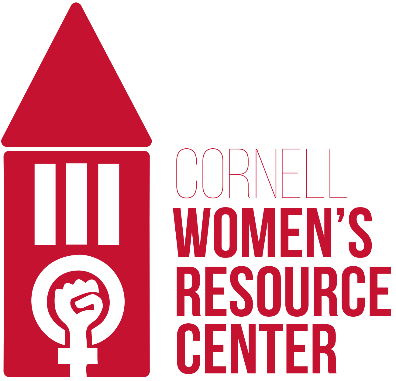
The Cornell Women's Resource Center lacked a logo that connected it to the university and its students. This was remedied by including a clock tower design with a feminist power fist at the center, acting as the clock face. The typeface is dignified and strong, much like the women involved with the organization. (2014)
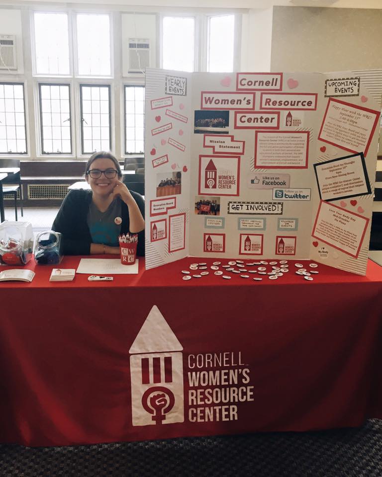
The Cornell Women's Resource Center lacked a logo that connected it to the university and its students. This was remedied by including a clock tower design with a feminist power fist at the center, acting as the clock face. The typeface is dignified and strong, much like the women involved with the organization. (2014)
Identity work in progress for an eSports company. (October, 2016)

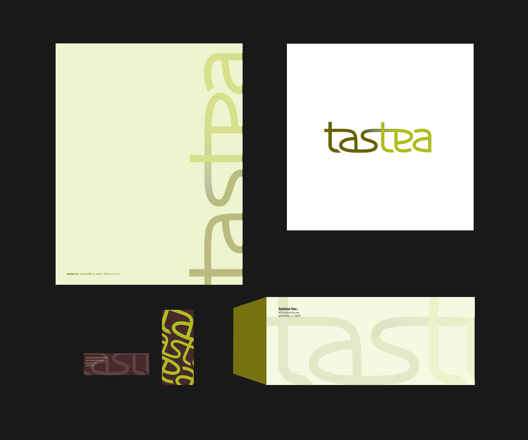
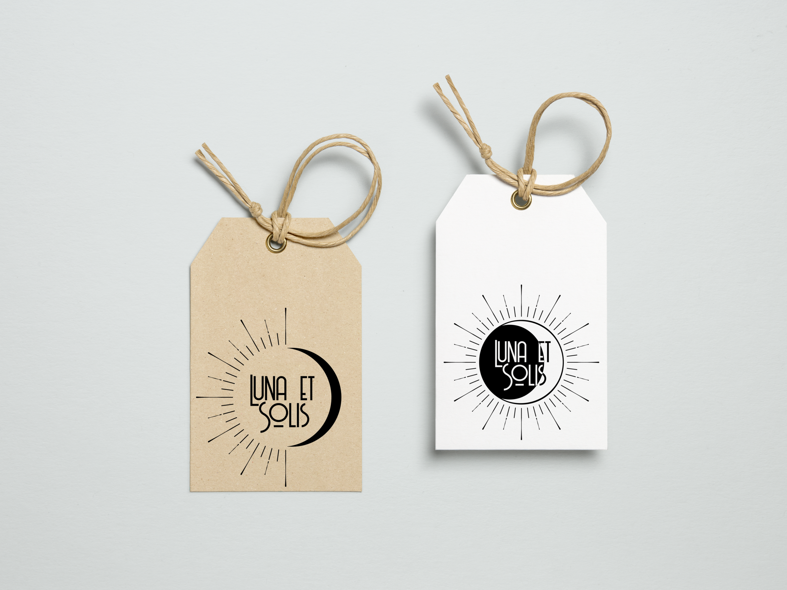
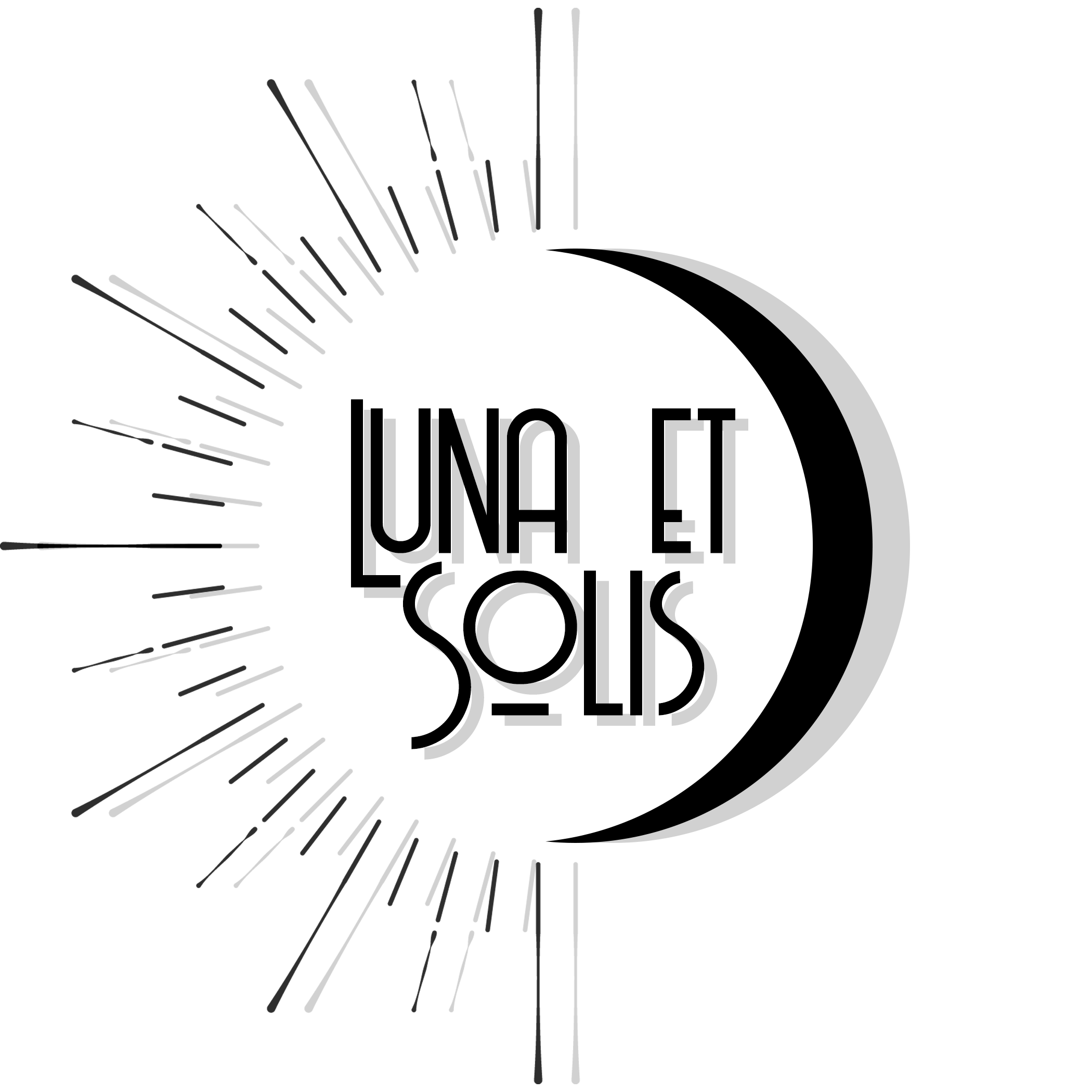
A full brand identity for an imagined tea business. Includes earthy tones and a contemporary custom sans serif logotype to attract a younger audience. (2012)
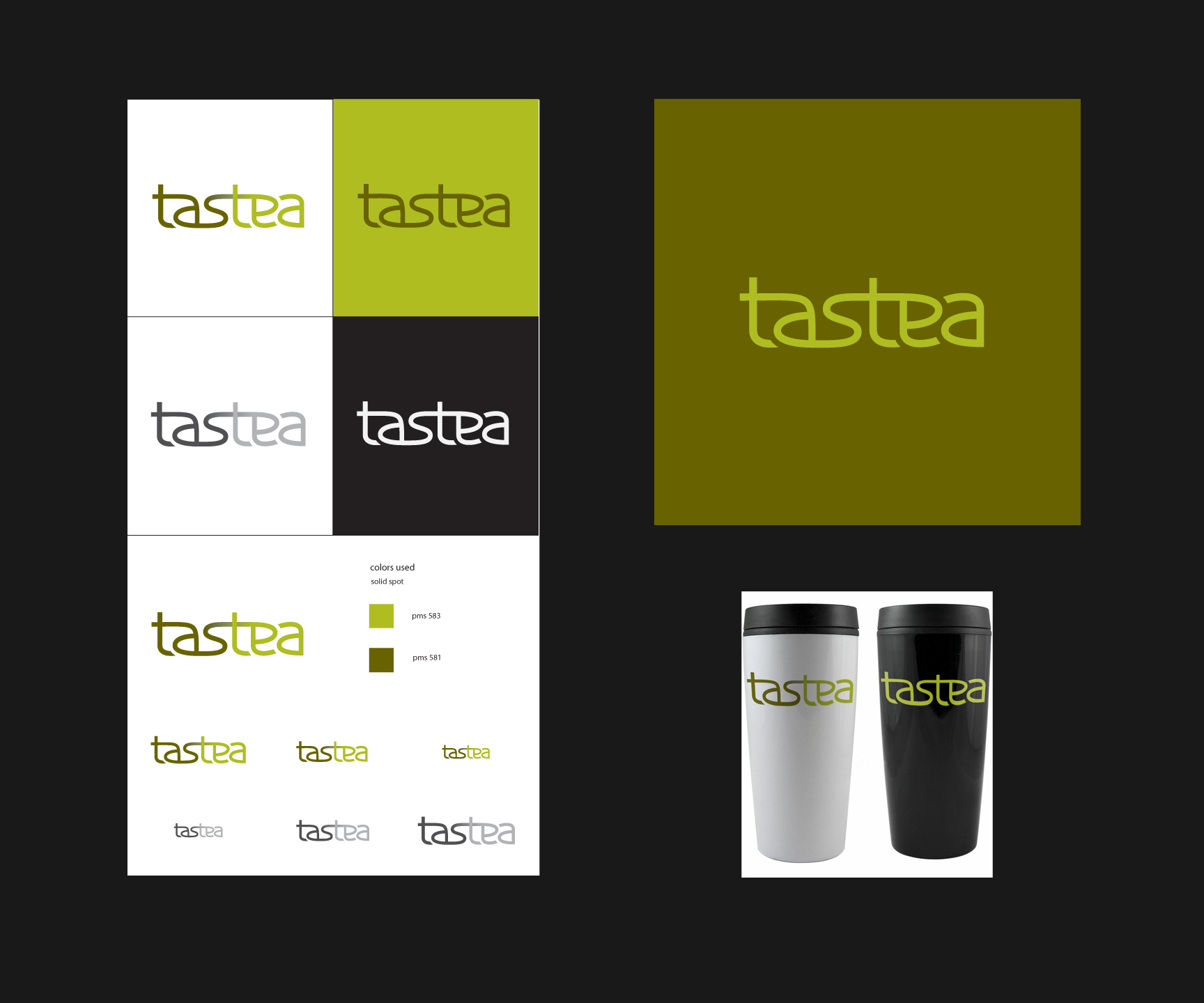
A full brand identity for an imagined tea business. Includes earthy tones and a contemporary custom sans serif logotype to attract a younger audience. (2012)
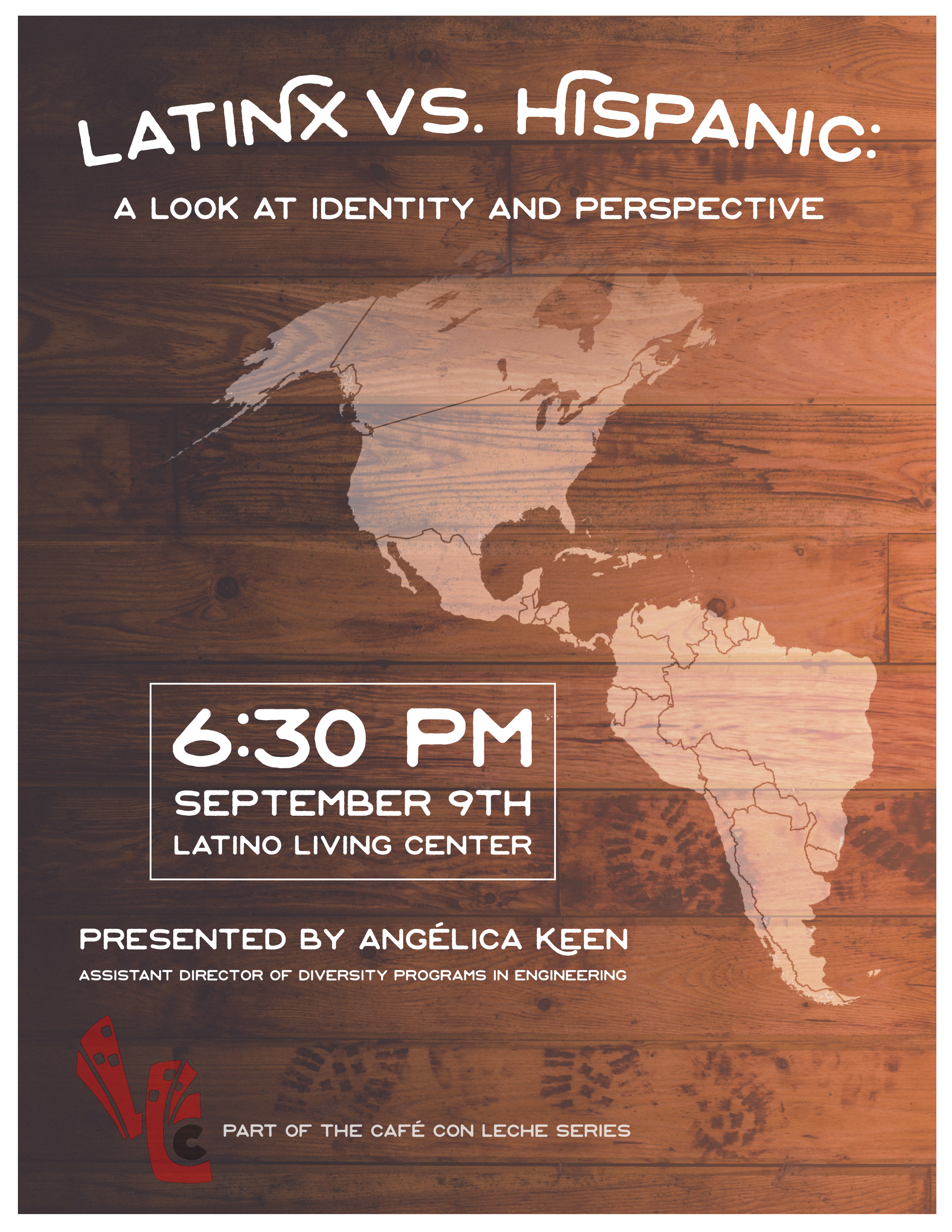
Poster for an event hosted by the Latino Living Center. The program was about the origins of the words Latinx and Hispanic, and its complicated geographic and social histories. (2016)
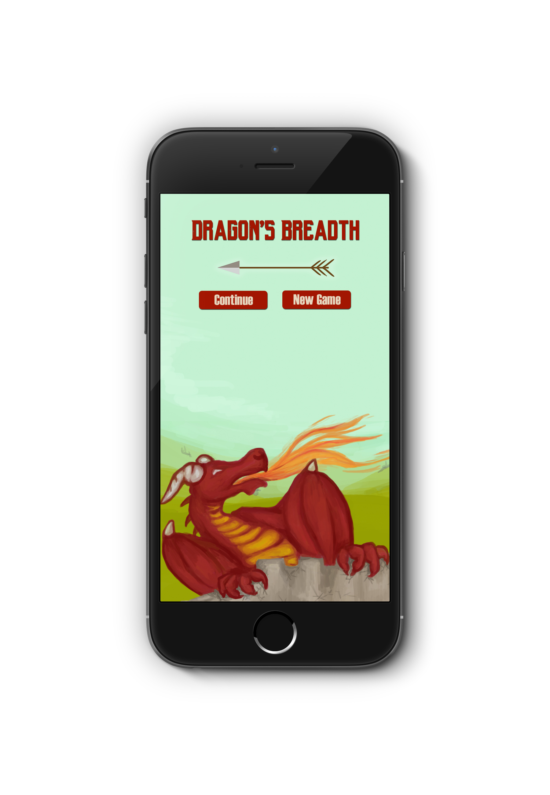
Dragon's Breadth is a collaborative project between a team of designers and programmers for Cornell's Advanced Game Design class. (2016)
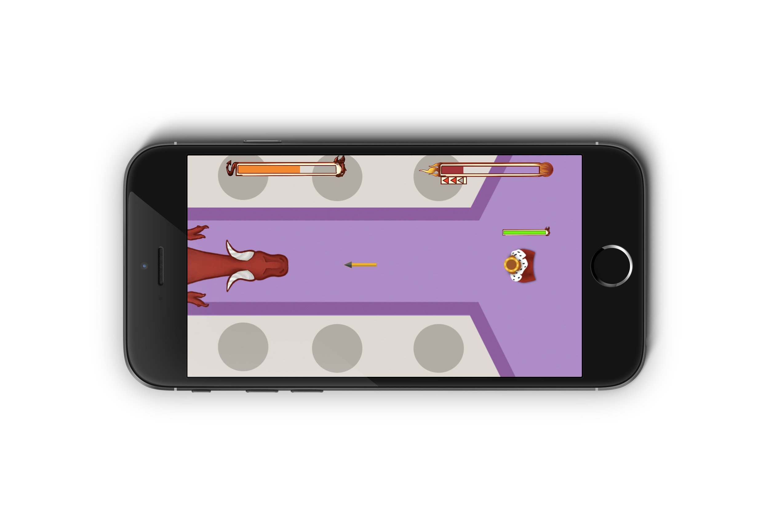
Dragon's Breadth is a collaborative project between a team of designers and programmers for Cornell's Advanced Game Design class. (2016)
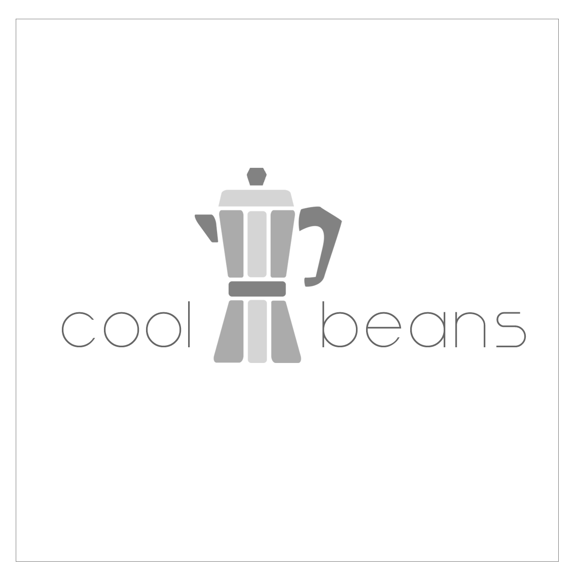
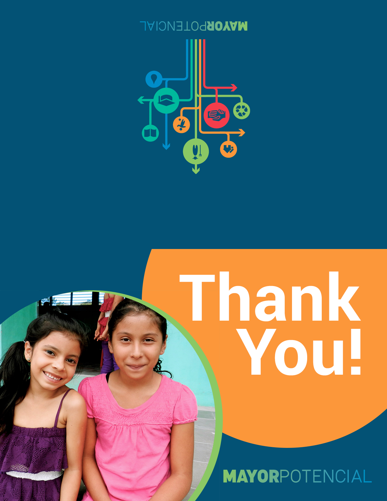
A practice exercise in icon making. Flat colors and a sans-serif font give it a sleek feel.